In the article in episode 1, I described the approach I used to design a component and started talking about the different elements that make up it up.
In episode 2, we will describe more precisely the architecture of the components.
Generating the project
The first step, to go into a little more detail about these components, is to generate a project.
To do this, and after following my last article, just open the Developper Command Prompt, create a dedicated folder for your component and finally enter this command:
pac pcf init --namespace MyNewComponentNameSpace --name MyNewComponent --template field
Note that I have chosen to generate a field project.
If all went well, you should get several files and a folder:
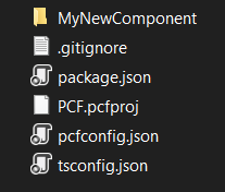
If you open the folder with the name of your component, you will find 3 elements there:
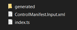
The “ManifestTypes.d.ts” file in the “generated” folder will not really be described in this article but know that you don’t have to modify this file because as the folder says it is …generated! It defines the input and output parameters according to the Control Manifest.
Control Manifest File
This file, which is generated when the component project is created, allows you to define the component itself. It will therefore contain all the metadata.
It is with this file that we will be able to, for example:
- Give a name to the component
- Specify what types of data we will use
- Specify the parameters you want
- Declare the resources (img, css…) that you want to use
- Declare which features the component will use (WebApi..)
- And finally the declaration of the typescript file that will implement the logic of our component.
This file is therefore composed of several nodes. The first one allows to define the component as well as the type of data on which it will be linked:
You can see that we find the namespace previously entered as well as the name of the component wich is also the name of the constructor.
The version number will allow you to specify that a new version has been designed, so the managed solution can be overwritten and replaced by the new one when you import it into your instance.
The display-name-key, allows you to enter a name for your component which will be seen when you add the component to a form.
The following parameter allows you to insert a short description of the component that will be seen on the UI.
Note that you can add a preview image by adding the preview-image attribute (it must have been declared in the resource part, we talk about it below in this article):
Inside this first node describing the control, we can find four other different types.
Data set
The first ones, is used only if you choose to create a component about a dataset. You will find that for this node there are not many properties:
Recently, a new property has become available, that of being able to keep the Commandbar, ViewSelector and QuickFindSearch. To do this, just add the property cds-data-set-options and indicate what you want to display:
Property
One of the most used and essential elements to design a component is the property.The latter allows you to specify and configure the data expected by the component.
For each property, it will be possible to indicate a technical name, a display name, a description whether it is mandatory and, above all, to specify the type of data that this property supports. The most particular attribute is the “usage”, it allows defining if this property will be bounded to a form field whose value can be altered by the component or if it is just a read-only property (input).
The data type allows the component to be made available only for them. So if you set the type to SingleLine.Text you will not be able to add the component to an int, decimal or text area field.
The data type of the property can be multiple, in this case it is necessary to use the notion of of-type-group which will allow defining several types.
Whole.None Currency SingleLine.Text Decimal
Input properties are configuration fields that allow people installing the component to specify values. The entered values are available at the execution of the component. As soon as you want to make your component customizable for technical aspects (token/bearer, url…) or design (colors that will be used for the user experience) you must play with them!
Finally, we can define the value of this property either by specifying a value by hand or by choosing a field of the form but keep in mind that it will only be read-only.
Resource(s)
During the last article, I mentioned the possibility of adding various resources in order, in the case of a CSS file, to make the component much more pleasant but also to have a clean component!
These resources can be of different extensions and if you have observed your generated project, there is already a declared resource: your TypeScript file that will allow you to initialize and manage the life cycle of your component! Be careful, because you can normally only declare one file of this type, but this does not prevent you from creating other files if you decide, for example, to implement an MVC model.
Apart from this specific resource, you can add four other types:
Css:
You will certainly have guessed it, this is where you can declare the CSS file that will be used to define the visual aspect of the component!
Note an important point: if you add the same component several times on a form, the last component to be executed will overwrite all CSS classes of the same name!
Img:
As I mentioned above, we can add a preview image of our component and therefore we will have to declare it here.
The usefulness of this resource is not limited to this preview image but especially to the images you could use inside your component. The goal is not to display an image with an external URL because it creates dependency and you cannot necessarily be sure that the target image will always be present at that address.
It is precisely a concept that I used in my first PhoneNumberByCountry component in which I display country flags according to the number on the form.
Html:
I confess that I haven’t been able to try this feature yet but it seems that it allows to create a user interface for the sitemap (?!).
Resx:
RESX web resources are really useful to manage the translation of the component, if we want to create a component with several languages and display the right messages etc…. In this case, we will create as many resx as you want to manage the language for your component.
For all resources, you can specify an order with the attribute of the same name to specify in which order these resources should be loaded!
Here is an example of how resources are used:
In this case, I decided to create specific folders for the different resources.
Feature(s) usage
The last node allows us to indicate if we want to use particular features in this component. Inside it, we simply add a line with the name of this feature.
Currently, these elements are only available for Model Driven Apps.
In case you want to execute queries using Web API, you will have to specify it here.
Note that it is not supported to perform an XMLHTTPRequest query and that you should use the Web API instead!
<feature-usage>
 <uses-feature name="WebAPI" required="true" />
feature-usage>

Comments (2)
Deep dive into Power Apps Component Framework – Part 4 : Walkthrough to create your first PCF (based on a field)! – Power Platform – Professional blog | Allan De Castrosays:
October 21, 2020 at 9:55 AM[…] Episode 2: Focus on … Control Manifest file! […]
Deep dive into Power Apps Component Framework – Part 3 : Focus on … Architecture & Component’s life cycle! – Power Platform – Professional blog | Allan De Castrosays:
October 21, 2020 at 9:55 AM[…] Episode 2: Focus on … Control Manifest file! […]